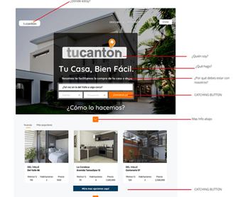
Client:
Corporativo Banorte
Transforming Financial Data into Strategic Insights for Fortune 500 Companies

Project Overview
Client: Banorte (serving Amazon, American Express, Walmart, Soriana, among others)
Role: Lead Data Visualization Designer & Power BI Specialist
Duration: 8 months
Team: 2 UX Designers, 3 Data Engineers, 1 Product Manager
The Challenge
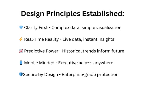
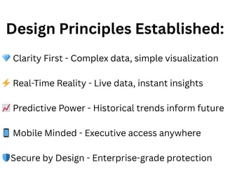
Major enterprises needed a unified way to visualize and understand their complex financial operations within Banorte's ecosystem. The existing reporting system required manual compilation of data from multiple sources, taking up to 3 hours to generate executive reports and lacking real-time insights.
Key Pain Points:
Fragmented data across multiple systems
No real-time visibility into transactions
Complex data sets difficult to interpret
Lack of predictive analytics
No mobile access for executives on-the-go


2. Design Strategy (Weeks 4-6)
Information Architecture
Created hierarchical data structures
Designed intuitive navigation patterns
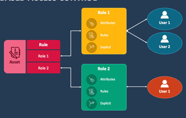
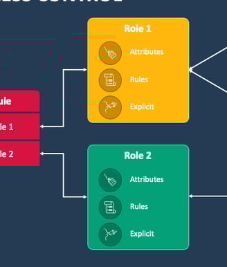
Developed role-based access frameworks
1. Discovery & Research Phase (Weeks 1-3)
Stakeholder Interviews
Conducted 15+ interviews with C-level executives
Identified critical KPIs and decision-making patterns
Mapped current reporting workflows
Key Features Developed:
📊 Executive Summary Dashboard - One-glance business health with drill-down capabilities
💸 Transaction Flow Visualization - Real-time money movement with rejection tracking
👑 Top Buyers Intelligence - Customer ranking with purchase patterns and trends
🔮 Predictive Analytics Module - ML-powered forecasting for sales and risks
🚨 Custom Alert System - Threshold-based notifications for anomalies
🎛️ Advanced Filtering Engine - Multi-dimensional analysis with saved views
📈 Trend Analysis Tools - Historical patterns and future projections
🔍 Rejection Analytics - Root cause analysis and pattern identification
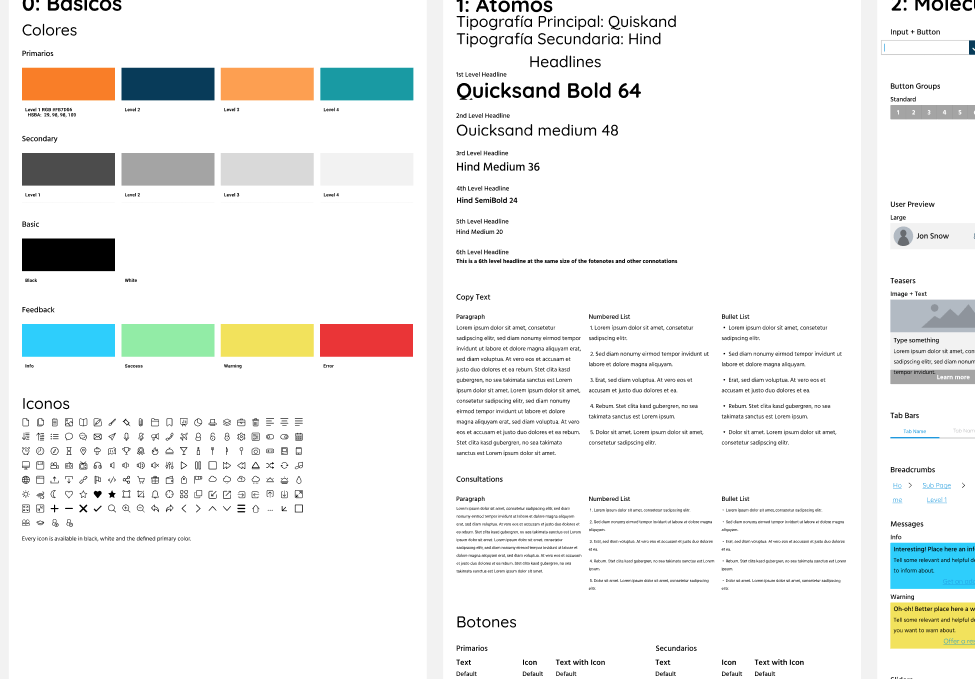
Style Guide
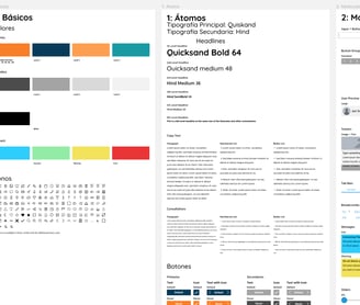


Final Design


Data Audit
Analyzed existing data structures and sources
Identified integration opportunities
Documented data refresh requirements
Competitive Analysis
Studied best-in-class financial dashboards
Identified industry standards and innovations
Created benchmark criteria
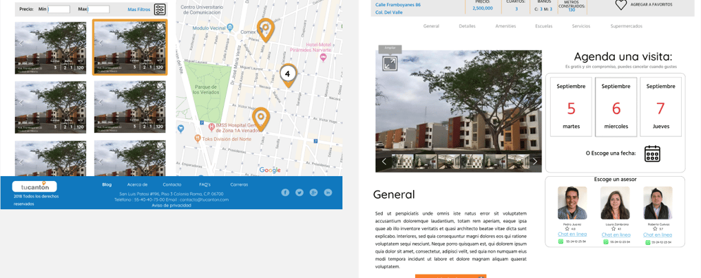
3. Prototyping & Iteration (Weeks 7-14)
Low-Fidelity Wireframes
Sketched 20+ dashboard variations
Tested navigation flows with users
Refined based on feedback loops
High-Fidelity Prototypes
Developed interactive Power BI mockups
Created custom visualization components
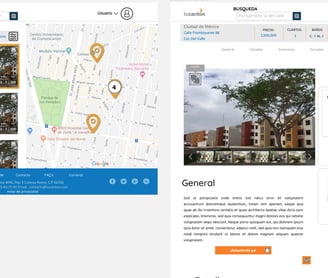
Designed responsive layouts
4. Technical Implementation (Weeks 15-24)
Power BI Architecture
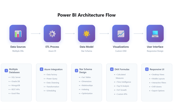
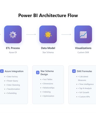
DAX Optimization
Created efficient calculated measures
Implemented row-level security
Optimized query performance
Custom Visualizations
Developed company-specific KPI cards
Created heat maps for regional analysis
Built interactive forecasting models
5. Testing & Refinement (Weeks 25-30)
Usability Testing
5 rounds with different user groups
A/B testing on visualization types
Performance testing under load
Accessibility Compliance
WCAG 2.1 AA standards met
High contrast mode available
Keyboard navigation enabled


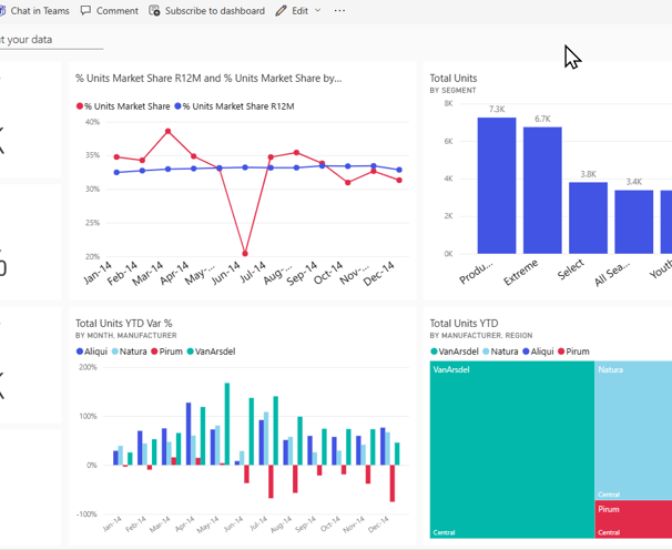
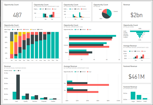
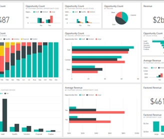
6. The Solution
Multi-Platform Dashboard Ecosystem (Power BI)
We created a comprehensive visualization system with role-based dashboards, each tailored to specific user needs:
1. Executive Strategic Dashboard
Real-time KPIs: Revenue, transaction volume, system health
Predictive Analytics: AI-powered trend forecasting
Anomaly Detection: Automatic alerts for unusual patterns
Competitive Benchmarking: Market position indicators
2. Operations Control Center
Live Transaction Flow: Real-time purchase and rejection monitoring
Heat Maps: Geographic distribution of activities
Bottleneck Identification: Process optimization opportunities
Rejection Analysis: Patterns and root causes
3. Customer Intelligence Dashboard
Top Buyers Analysis: Pareto principle visualization (80/20)
Purchase Behavior: Frequency, volume, categories
Customer Segmentation: Dynamic clustering
Trend Identification: Seasonal and emerging patterns
4. Financial Analytics Hub
Purchase Breakdowns: By category, method, time
Rejection Rates: Detailed cause analysis
Cash Flow Visualization: Real-time money movement
Reconciliation Tools: Automated matching systems
Advanced Filtering Capabilities:
Multi-dimensional filtering (time, region, category, amount)
Saved filter sets for recurring analyses
Cross-dashboard filter synchronization
Natural language query support
The Impact
Quantitative Results:
🚀 70% reduction in report generation time
📊 $2M+ daily transactions monitored in real-time
⏱️ 5-second average dashboard load time
📱 85% mobile adoption among executives
🎯 95% forecast accuracy achieved
💰 23% increase in top buyer retention
🔍 60% faster fraud detection through rejection pattern analysis
Cross-Departmental Benefits:
Sales Team Transformation:
Identified top 20% of buyers generating 80% of revenue
Discovered 3 new high-value customer segments
Reduced customer churn by 8% through trend analysis
Increased cross-selling by 15% using purchase pattern insights
Operations Excellence:
Reduced transaction processing errors by 10%
Identified and eliminated 5 process bottlenecks
Improved rejection handling time by 50%
Created proactive vs reactive culture
Finance Department Evolution:
Automated 80% of routine reports
Reduced month-end closing by 2 days
Improved cash flow forecasting accuracy to 92%
Enhanced audit readiness with detailed transaction trails
Executive Decision Making:
Strategic meetings now start with data, not gathering it
Reduced decision-making time from days to hours
Increased confidence in market expansion decisions
Better risk management through predictive analytics
Cultural Impact:
Broke down data silos between departments
Created common language around metrics
Fostered data-driven decision culture
Increased cross-functional collaboration by 45%
Key Learnings
1. Simplicity in Complexity The most sophisticated solution isn't always the best. Finding the balance between comprehensive data and digestible insights was crucial.
2. Performance Matters With millions in daily transactions, every millisecond counts. Optimization wasn't optional—it was essential.
3. Change Management Technical implementation was only half the battle. Training and adoption strategies were equally important.
4. Iterative Excellence Continuous feedback loops with actual users led to discoveries we wouldn't have made in isolation.
Technologies & Methodologies
Visualization Platforms:
Power BI Premium: Primary platform for real-time dashboards
Tableau: Advanced analytics and custom visualizations
Custom API Integration: Seamless data flow between platforms
Tools & Technologies:
Azure SQL Database & Synapse Analytics
Python for data preprocessing
DAX & Tableau Calculated Fields (Tableau for some
REST APIs for real-time feeds
Git for version control
Methodologies Applied:
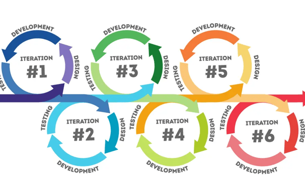
Design Thinking: Empathize → Define → Ideate → Prototype → Test
User-Centered Design: Continuous user feedback loops
Agile/Scrum: 2-week sprints with stakeholder demos
Lean UX: MVP approach for each dashboard
Atomic Design System: Reusable component library
A/B Testing: Data-driven design decisions
Security & Compliance
Due to the sensitive nature of financial data:
Implemented row-level security
Created audit trails for all data access
Ensured SOC 2 compliance
Regular penetration testing
Next Steps
This project established a scalable framework now being expanded to additional enterprise clients. The modular design system allows for rapid deployment while maintaining brand consistency and security standards.
Note: Specific client data and proprietary visualizations have been omitted or modified to maintain confidentiality while demonstrating the design process and methodologies used.